Marek Konstanty
Account Manager
2025-03-03
#Development
Time to read
12 mins
In this article
Introduction
A subjective list of essential features of user-friendly mobile apps
Onboarding ‘how-to’ screens
A user-friendly, responsive interface
Smooth performance, data caching & quick load times
Quick registration (third party logins) & seamless logins
Targeted push notifications
Clear and easy navigation
Battery preservation
Security
Accessibility
Final thoughts: crafting a user-friendly mobile app that users will love
Share this article
Introduction
The world of mobile applications is in a never-ending state of evolution. While some features may have once seemed extraordinary, they soon became things of expectation. Users, therefore, expect a great deal from their mobile apps. They either want fast, intuitive, and interesting applications, or they would drop them. An app is no longer about just being functional; it has to be functionally enjoyable to use and even perform some of its functions without much input from the user.
The app design serves as the last point in favour of user-friendliness. In fact, an intuitive app design is one of the most sought-after characteristics of a user-friendly design. Every action counts, be it navigation, security, performance, or accessibility. Features that were top of the list are now being calculated among the foremost expectations, and users tend to be frustrated whenever an app is less than smooth. App developers must not only keep pace with technological advances but also gain the insight necessary to track the changes tied to the user behaviour and habits.
A subjective list of essential features of user-friendly mobile apps
While there is no universal recipe for what makes for a perfect mobile app, some elements appear to form almost a checklist, useful in many industries and use cases. These are not just good-to-have additions; they mark the app as either really user-friendly or just another boring piece of software. Some features sound very evident but their half-baked execution can destroy the entire app experience. Others are not a must-have for every application, but they should surely be part of any consideration during mobile app development.
Here, we have assembled a totally subjective list of ten must-have features for making an app feel intuitive, smooth, and ready for the future. The order is random; what might be paramount for one app might take a back seat for the other. Nevertheless, each feature does keep the user engaged, rather than frustrated enough to make them leave. Let us break these down.
Request a free design consultation
Facing design challenges? Contact us for a free consultation in just 1 step!
Onboarding ‘how-to’ screens
Not everyone is tech-savvy, but even tech-savvy people like to be introduced to an app quickly. The complementary onboarding should ideally communicate quickly what the app can do for the new user, as well as its key features, without overwhelming the new user. A good onboarding experience helps user retention because it allows the user to see the value of the app before he or she starts wondering about it on his or her own.
There are many methods of going about this. Some applications have a welcome screen or maybe a couple pointers to set off on the right path. Others, however, will need a complete walkthrough to help users through fairly complex features. Interactive tutorials, context-sensitive tooltips, or progressive disclosure (presenting information as necessary rather than all at once) can all contribute depending on the complexity of an application. It's all about finding a happy medium - too little or too much guidance, can make users either feel lost or skip the whole thing. It must be informative yet concise, guiding - but not annoying.
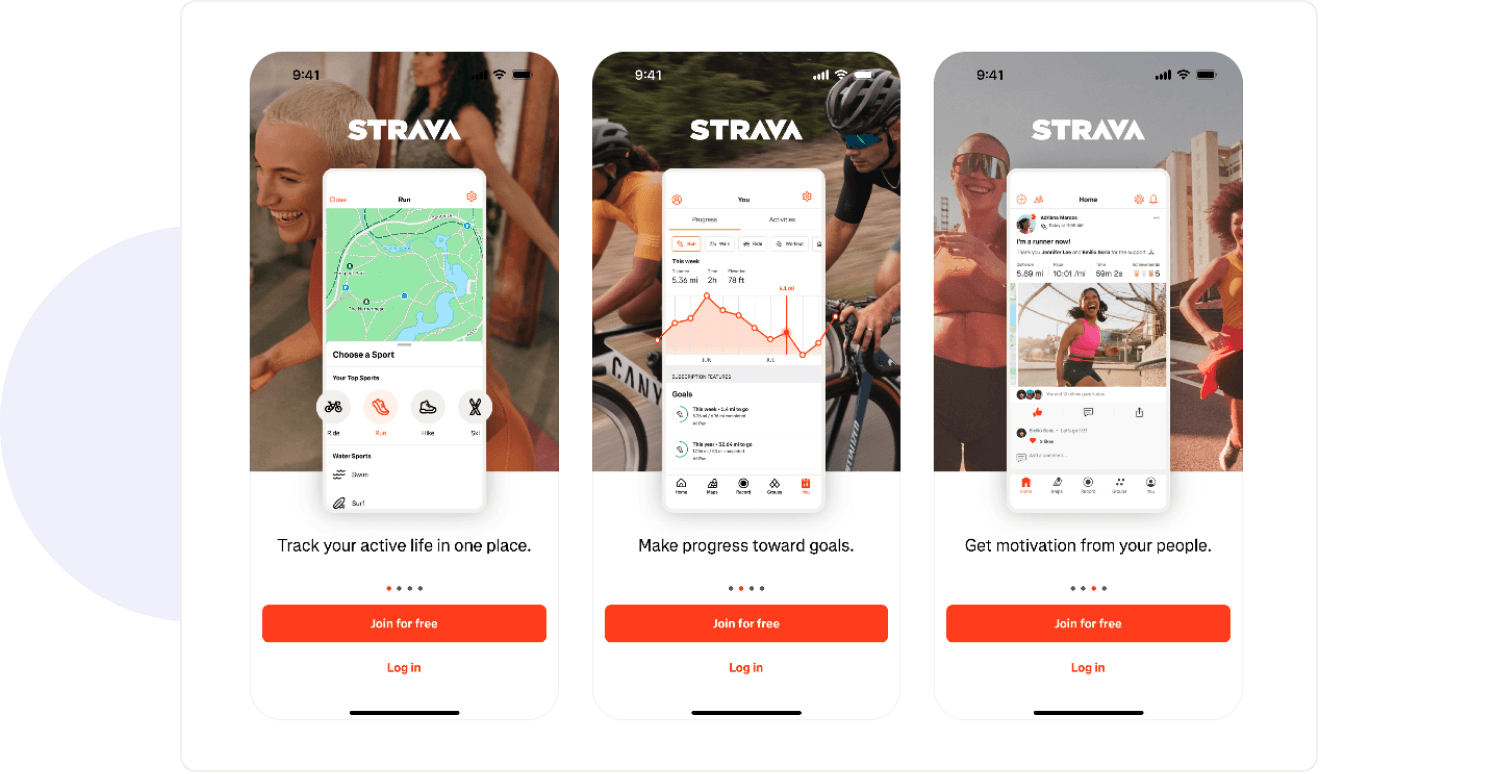
Strava
A user-friendly, responsive interface
User expectations evolve, just as UX design does. What was once intuitive five years ago might seem ancient or even clumsy today. A state-of-the-art mobile application must adhere to contemporary design standards while remaining flexible enough to embrace new paradigms. This requires strategic placement of navigation elements with a clearly defined visual hierarchy of interactions that feel natural, irrespective of size and device.
Key user interface elements like back buttons, menus, and core features are largely standardized for a reason—users instinctively know where to find them. Straying too far from these conventions without good reason can lead to confusion and frustration. However, responsiveness is equally crucial. The app needs to feel fluid, flowing seamlessly from one action to the next, with immediate feedback for every action. A lag in buttons, misalignment in layouts, or inconsistencies in gestures ruin the user experience and drive them away. Thus, a well-thought-out UI addresses both form and function; it ensures that no gesture-a tap, swipe, or scroll-will feel cumbersome to the user satisfaction.
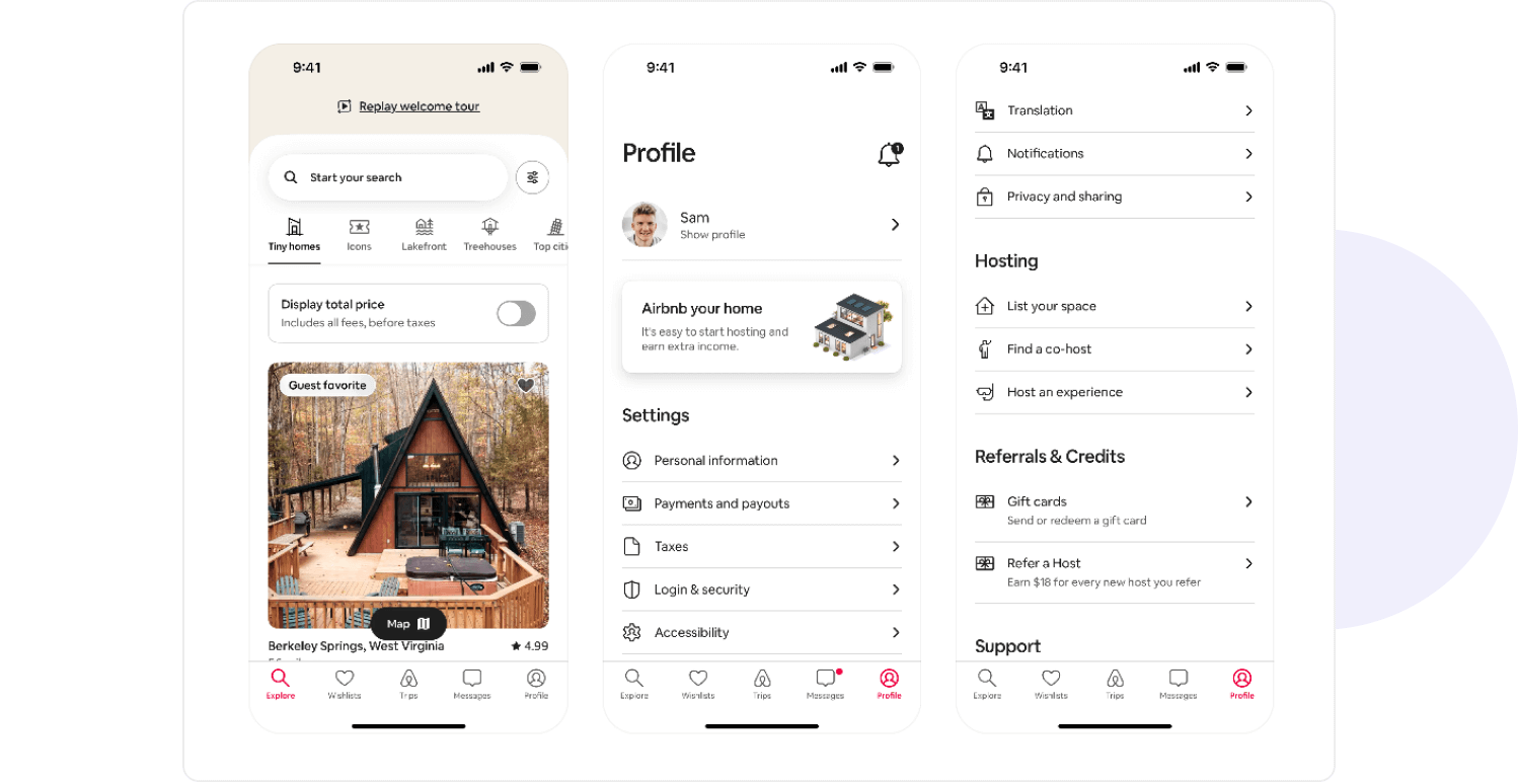
Airbnb
Smooth performance, data caching & quick load times
Speed is everything. Users are now impatient with an app's performance and expect instantaneous response times. Everything from opening the app and loading new content to submitting data should feel fast and quick. If an app is sluggish, it is not just annoying; it gives the impression that its quality is poor even if its features are awesome.
Caching does some great work to realize this. If data is used numerous times, simply put it on a local store instead of repeatedly fetching it from the server. This lessens the need for unpredictable network calls, thereby reducing loading times while providing a better experience, especially for users operating on slow or unstable internet connections.
With every ounce of optimization an app can bear, there will always be slower actions. This is when loaders and skeleton screens come into play; instead of allowing users to stare at a blank page, the skeleton gives them somewhat of a visual placeholder, displaying the crux of the content before it loads. Such a small detail calms users mind, giving them the feeling that the application is running, thus making the waiting seem shorter. Fluid animations and instant UI feedback, together with real-time updates, aid in reiterating how fast the app feels and keep users engaged instead of frustrated.

Uber
Quick registration (third party logins) & seamless logins
Filling long registration forms is one thing that no one, including me, wants to do - particularly on a mobile device. The more friction that exists in the sign-up process, the greater the odds of dropping out. An instant and speedy access experience is what users put their expectations on, and if the app demands too much information before even starting, that percentage drops really low.
This is why the inclusion of third-party logins like those of Apple, Google, or Facebook has become imperative, done to avoid the headaches of having to remember one additional password, while at the same time fast-tracking the onboarding process. Perhaps delaying the necessity to register could be adopted in a user journey where there is no third-party authentication. Customers of airlines or rental car companies are allowed to browse and choose, without any registration. When they are asked to register - they are already committed to the service.
Another form in which these kinds of entries are available (providing maximum safety and comfort) is the possibility of biometric authentication (fingerprint, Face ID). Accessing online services has become instantaneous, with no need to type your credentials repeatedly; re-authentication becomes seamless. It is not surprising that biometrics have made widespread uptake by banking and finance apps but useful in all applications where speed and security count.
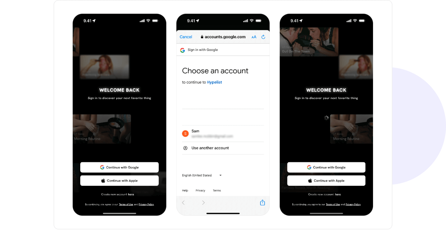
Hypelist
Targeted push notifications
The term push notifications makes one think these are a double-edged sword. When done right, they keep users engaged, informed, and connected to the app. When done wrong, they're meaningless and simply annoying, at times being ignored altogether or worse, switched off. The keyword here is relevance. Each notification should palpably sound unsolicited, for instance, simply "we-can" send them for the app.
In order to stand out, targeted push notifications have to personalize messages and prompt actions.
- An e-commerce app sends notifications to a user about price drops on items they viewed - informative
- A banking app serves a reminder of a bill due - useful
- A news app pushes breaking stories according to what users have been reading - well, isn't this all about pleasure?
Technically, deep linking - making sure that tapping a notification open its relevant content or action - definitely fills the gap. No one wants to hit a home screen and start manually searching for what they need. Push notifications ought to facilitate the user journey by acting as a bridge between user needs and the app's functions. When done right, these notifications are more than just reminders; they become part of a great user experience.
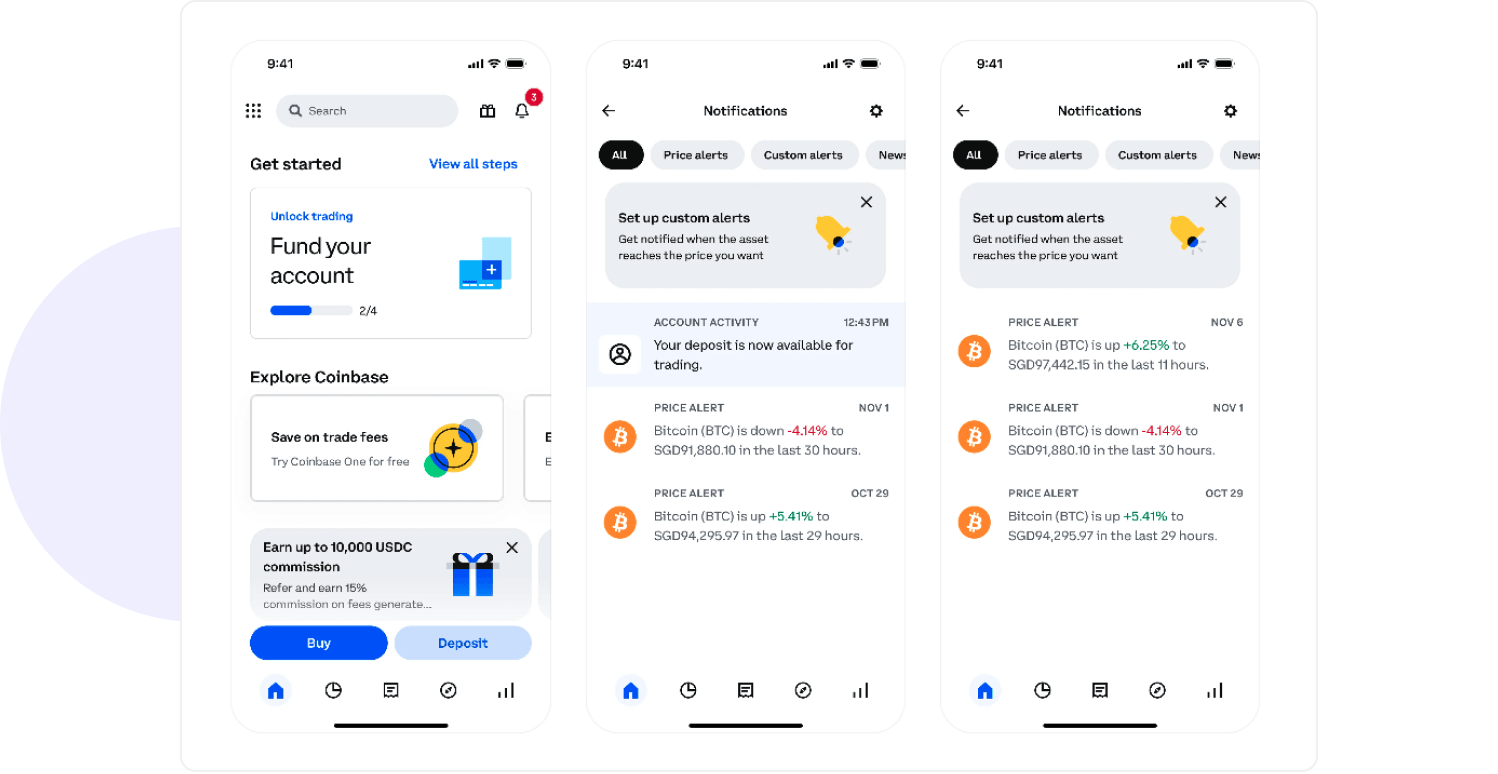
Coinbase
Clear and easy navigation
Nothing is more frustrating for users than getting lost in an app. If they cannot find what they are searching for in just a few taps, the experience morphs into irritation faster than you can say "frustrated." A good navigation system lets users feel they are always in charge; they can traverse freely, navigate back, or access vital sections without stopping to think.
The main navigation should always be present and accessible - be it a bottom tab bar, a side menu, or a floating action button focused on major actions. There are reasons standard patterns are used; reinvention without strong justification often results in confusion. Returning to the previous screen should also be easy. External back buttons, swipe gestures, and persistent navigation structures should work together so users do not feel "trapped" on any of the screens.
Great navigation is not just about how things are being organized; it needs to be fast and predictable. Users should know intuitively where they need to tap next; the moment they spend longer figuring out how to navigate your app than enjoying it is a terrible UX. Today, a bad navigation experience could mean the difference between keeping a user or losing him for good.
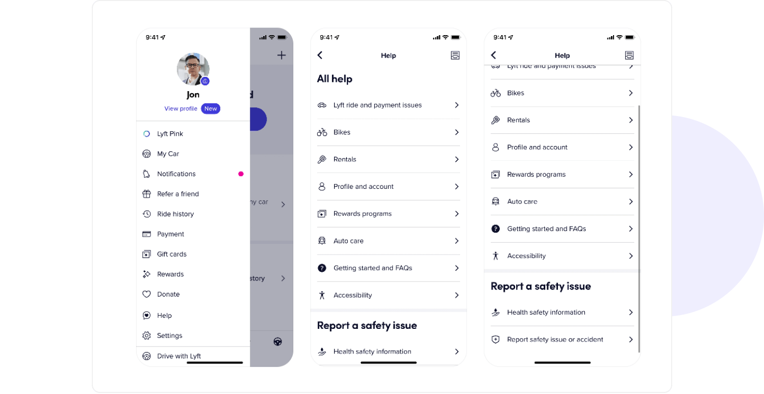
Lyft
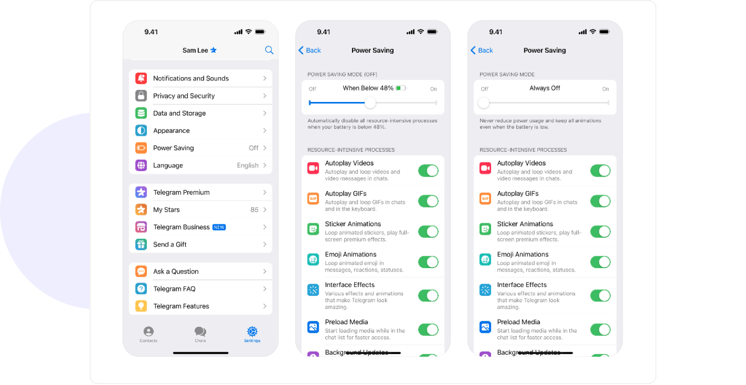
Battery preservation
Users hardly notice whether an app is optimized for battery usage or not, but certainly, it doesn't go unnoticed when an app consumes a lot of battery. It proves to be equally frustrating when one app runs on the background and consumes power to see a quick drop in battery percentage. If the app consumes a lot of resources, then the worse things would happen- users will either restrict their usage or, uninstall the app completely.
High power consumption can be linked to real-time data updates, locating a user, background running processes or graphics that use a lot of memory. However, it's important to mention that there is always unavoidable usage of power. An optimal configuration of how an app consumes background activity, network calls, and animations can change the preferences of battery consumption. Simple improvements - including limiting unnecessary refresh rates, employing intelligent data caching, and reducing wake locks - prevent excessive battery consumption.
Suppose it is an application absolutely needed to drain more power (navigation applications, fitness trackers, or AR applications). In that case, it needs to be transparent with the users by giving options for turning on or off battery-saving modes, changing update frequency, or limiting background activity. To put it simply - an application makes something efficient, not by making it power-hungry. Users will be more grateful by keeping such apps on their devices.
Telegram
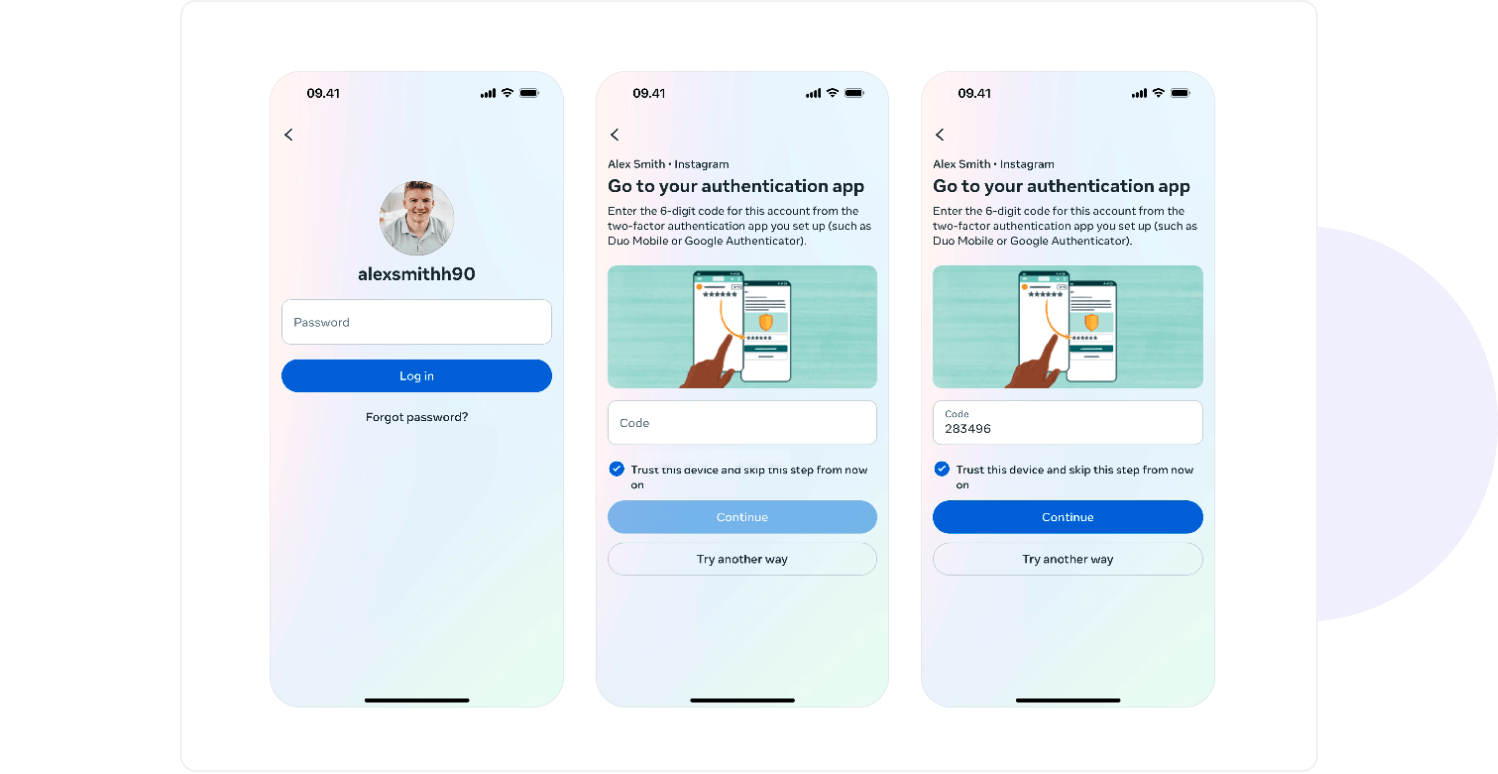
Security
Security isn’t merely a backend concern anymore; it starts with trust: if users don’t trust you to protect their data, they aren’t going to use your app. In this day and age, Security-By-Design must be followed, meaning that from day one security features ought to be a priority rather than an afterthought. The development lifecycle should involve best security practices in every phase: architecture, code, testing, and deployment.
Apart from password protection, Two-Factor Authentication (2FA) is a straightforward method to prevent hackers from accessing sensitive information. Adding a bit of extra assurance in the way of SMS codes, authenticator apps or users own biometric methods - makes users a little less worried about anyone else obtaining access to their accounts. The argument is compelling, and hence most industries, primarily finance, healthcare, and e-commerce sectors, are making these systems mandatory.
Security goes beyond validating identity; it also includes encrypting sensitive data, securing API endpoints, proper session handling, and vulnerability testing. Although these activities may transpire behind the scenes and out of the public eye, when something catastrophic occurs, everyone tends to find out. A breach, leaked username/password combinations, or a person losing control of an account go well beyond the application itself and start removing essential aspects of the perception of its brand in the mind of the public. So, it's not an option to invest in security; it's a requirement.
Accessibility
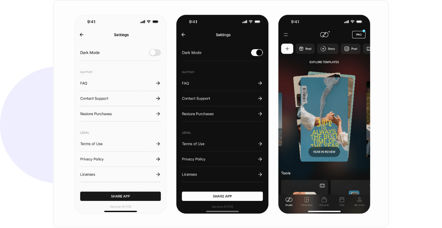
Accessibility is not just an option; it is a need. A mobile application that does not pay attention to what accessibility features include alienates a large chunk of users. Though there are many people who can easily access app interfaces, others depend on some characteristics of an application to be usable by them. One such characteristic is scalable text. If your target demographic includes older users or users with visual impairments, scaling text to a comfortable size must be among your considerations.
Accessibility goes beyond font scaling. Consider contrast levels, readable fonts, and voice-over support versus visually impaired users. If an application is frequently used in low-light conditions, a dark mode is not a fad; it is a feature that relieves eye strain and saves battery life on OLED screens.
More considerations include clear focus states for keyboard navigation, well-structured UI elements for screen-readers, and colors that consider color blindness amongst others. When you design your products while keeping in mind the accessibility departments, you do not simply have specific enhancements for a particular category of users; you also improve the experience for everybody. A really user-friendly app is one that works for the widest possible range of people, in the widest possible range of situations.
Unfold
Final thoughts: crafting a user-friendly mobile app that users will love
A successful app, not one that just builds a bunch of features, but one that creates a seamless experience. The user-friendly app guides and helps the user without overwhelming him; efficient and responsive; offers the best in security, accessibility, and usability.
That's the difference one makes when considering the critical features early on; onboarding experience that helps, navigation that feels immersive, performance that is top-notch, and smart login options. These shape the way users see the app and use the app. Not every app may need all features, but ignoring these can lead to frustration, high drop-off rates, and ultimately, failure.
User demands change, and technology changes with it. The best mobile app are not designed just for the current generation of users; they should build capabilities for growth and evolution to ensure your app relevance in the future.
Marek Konstanty
Account Manager
Share this post