Kasia Michalska
UX/UI Designer
2024-06-11
Updated: 2024-06-13
#Design
Time to read
10 mins
In this article
Overview
When is the right time for a styles-to-variables switch?
Setting up part 1 - keep your project organized with styles, components, instances
Setting up part 2 - clean up your color palette
Creating variables
Assigning new colors to your interface
Preparing dark palette
Adding dark mode colors and variables
Let the magic happen
Summary
Share this article
Overview
Variables are the latest addition to the functionalities of Figma. They are derived from programming languages and serve the exact purpose as their name suggests - to hold variable values. I won’t be describing the functionality in depth here; learning materials are available on the Figma website and YouTube, and many videos have been produced on this topic. I'll instead focus on how, with basic knowledge, you can utilize them to create a dark mode for your project and, in the meantime, give some tender loving care (TLC) to colors in your Design System - hopefully not a long-awaited one ;) - but we all know how it is sometimes.
When is the right time for a styles-to-variables switch?
I’ve asked this question directly to the Figma advocate himself, and the answer was an expected 'It depends.' Actually, I cannot give any other, better answer myself. But I can give you some signs that made me decide that 'it is time'. And of course, as a disclaimer, everything depends on the nature of your project, available time and resources, the openness and willingness of the client to participate, and your interest in this topic as a designer. Of course, if you have the opportunity, I really encourage you to try starting with variables right away when beginning a fresh project. However, more often we find ourselves somewhere in between projects, jumping in at the middle stage or inheriting work from another designer. So, without further ado, here are some catalysts that started the variables reaction in my brain:
- Out-of-date color palette in the design system - this was the result of the ongoing design process and the recent addition of new colors. We wanted to wait until all UIs were ready and set to clean up the palette.
- Curiosity about the feature - pretty self-explanatory. After the release and many presentations of the feature, we wanted to try it ourselves and, of course, learn in the process.
- Problematic and not useful style names inherited from brand guidelines - we got the palette from the brand guidelines of the company and inherited the names as well. They worked at the beginning, but due to them being too long and Figma's limited space in the right-side panel, they were more of a burden than an assistance in the workflow.
- Messy libraries on the frontend - mostly due to mess in the design system palette, they needed a serious clean-up.
- Less intensive time in your project - when all design-intensive work is done, the UIs are handed off, and the role of a designer becomes more of a supporter/maintainer, it may be a good time for (spring) cleaning.
Request a free design consultation
Facing design challenges? Contact us for a free consultation in just 1 step!
Setting up part 1 - keep your project organized with styles, components, instances
Before starting the process of implementing variables into an existing project, we need to do some prep work to ensure smooth and efficient (as well as effective – keep reading ;)) operation in the future. Here is a checklist of all the things we need to take care of beforehand:
- Ensure the component library is connected to your current designs and styles.
- Make sure repeatable UI elements are created as components.
- Ensure template screens are created as components and from components, and are used as instances throughout the project.
- Ensure all components are up-to-date and published.
- Check for colors without assigned styles and fix them.
Setting up part 2 - clean up your color palette
PRIMITIVES
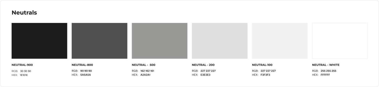
Now that your project is cleaned up from an architectural perspective, we can tackle the colors themselves. Firstly, review your palette for any unused colors and styles. Maybe add new ones if they haven’t been added already and are used in your project. Next, organize them - if they aren’t already - into color groups (such as grays, neutrals, blues, pinks, reds, and so on), and also by values - lightest to darkest. You can eyeball it based on the HSL or HSB values, looking for luminance in the first one or brightness in the second. Based on this, you can group your colors and start renaming them to primitive values that will serve as a base for future semantic colors. I used the most common way and named my colors (Neutral/0, Blue/100, Red/800, and so on). This makes it rather flexible to add more colors in the future when adding a dark mode, with values that can range from 0 to 1000 (with 100 or 50-point increments).
SEMANTICS
With a primitive palette ready to go, we can now prepare the variable palette or semantic palette for better naming. This will require some thinking and planning on our part, and the semantic names need to be unique and indicative of the color's use in the app. We should avoid using the exact color name in the semantic name, as this will not serve its purpose as a variable color.
”Semantic naming involves giving meaningful and descriptive names to design elements, based on their function or purpose, in a way that is easy to understand and remember(...)” - quote by Evan Reisberg
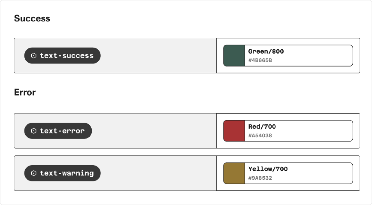
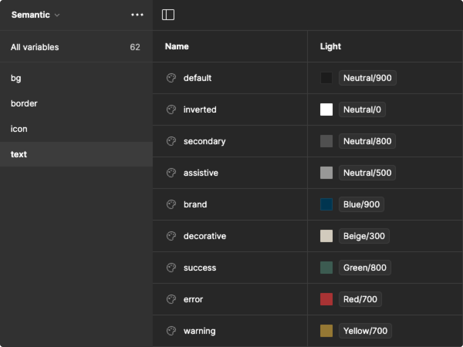
We can search the internet for many useful names, but some of them will be so specific to our project that we will need to tap into our creativity to name them. However, let’s start with something simple. Let’s divide our semantic colors into four groups: Fill, Outline, Icon, and Text. Each component, molecule, banner, input, form, or modal is constructed using some or all of these groups. Let’s take a small step and begin by creating some semantic names for Text. Here are some popular names that can be used in most projects:
- text/primary
- text/default
- text/secondary
- text/tertiary
- text/error
- text/warning
- text/success
Then, of course, we can explore less conventional and more creative names for how we use the color:
- text/decorative
- text/accent
- text/alternative
- text/inverted
- text/assistive
- text/brand
- text/inactive
Now, we need to assign primitive values to semantic meanings, although not yet as variables. This will also depend on your palette. For example, you can designate Neutral/900 as text/primary, Red/500 as text/error, and Purple/600 as text/brand.
Now, you need to repeat this process with Fill, Outline, and Icon. Determine the purpose of the color, name it, and connect it to a primitive value. Keep in mind that the same color in primitives can be assigned to many semantic values. This versatility is necessary to keep the library adaptable and ready to be converted into variables. For example, Neutral/900 – a dark color – can be used for text/default, icon/primary, background/accent, outline/accent, and many more.
Creating variables
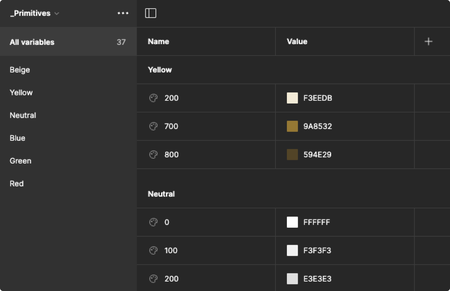
PRIMITIVES
With all the palettes ready, we can start setting up the variables. We open the 'Local variables' section in the right-side panel after deselecting everything on the canvas. Let’s begin by creating the first collection and naming it '_primitives' or '.primitives.'
Tip: Prefixing the name of the component or collection with '_' or '.' hides it from being published. In our case, it's beneficial to hide it, so we can only see and use the semantic colors (which we'll create in the next step) in other files without cluttering the files with palette that is not meant to be used there.
Next, we add each of our shades as a color value and name it the same as we decided earlier. The value of the primitive color will be a HEX value.
SEMANTICS
With the primitive palette ready, let’s quickly add, in a similar manner, the semantic palette that's going to be used throughout the whole project. Start by creating the next collection – you can name it 'semantic' or anything that resonates with you and your use of it. Next, we add each semantic color as a color value and name it the same as decided earlier. The value of each semantic color will now be aliased with a value from the primitive palette.
Assigning new colors to your interface
This step can be time-consuming, depending on the scale of your project. We need to publish and assign the semantic colors to our designs to ensure everything works smoothly. I will share some tricks and shortcuts to expedite the process ;)
To start, try assigning the colors to your master component in your Design System/Style Guide or any local master components in your project files. This should address most of the color occurrences without needing to go through each screen individually. Simply publish, update, and check for any oversights. If any remain, let’s not waste time and try some clever solutions to fix them.
TEXTS
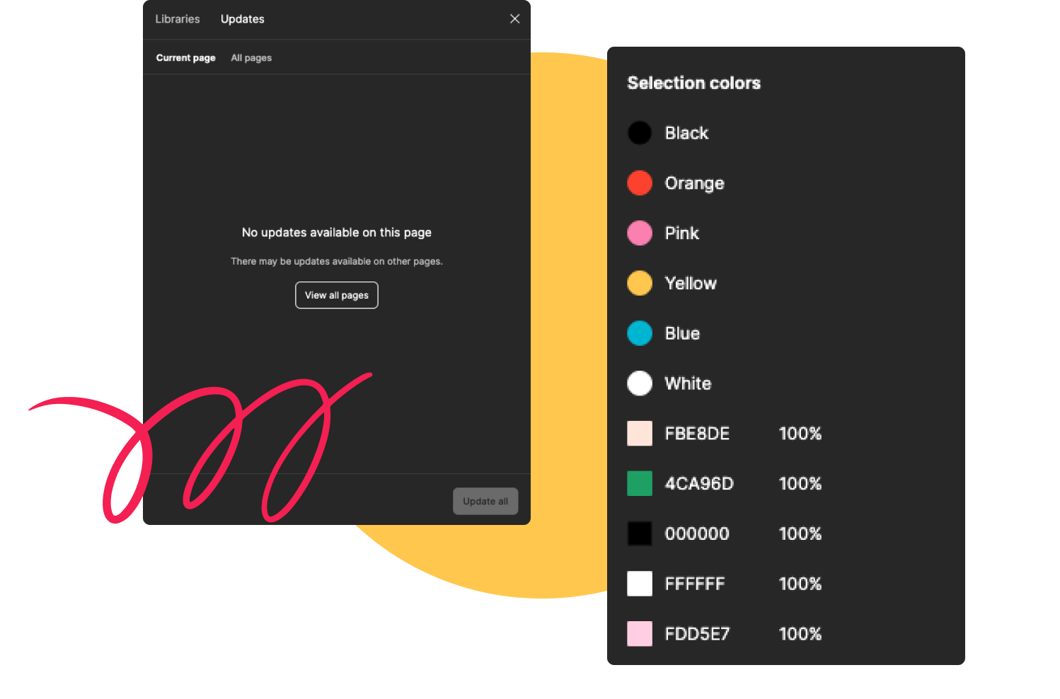
Take advantage of the 'Edit -> Select All With -> Same Font' function. It will quickly highlight all text with the font you previously selected, and through the 'Selection colors' panel, you can efficiently assign all text/... semantic colors. Repeat this process with all fonts in the file to ensure you catch any that were not connected to a style.
ICONS
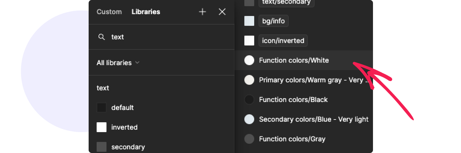
For icons that are variants of an instance, simply select one and go to 'Edit -> Select All With -> Same Instance.' Assign all icon/... colors appropriate to their function. Alternatively, use the Search function by pressing command+F and typing 'icon.' All layers and elements with this word will be found, allowing you to quickly assign the semantic colors through the 'Selection colors' panel.
BORDERS
For borders, you can try the same trick with the 'Edit -> Select All With -> Same Stroke' function. However, be cautious, as some borders may have the same hues but require different semantic values.
FILLS
Fills are the most challenging to optimize. You can attempt using 'Edit -> Select All With -> Same Fill,' but here, even more than with borders, you may encounter cases where the same color needs a different semantic assignment. Proceed with caution to avoid confusion. Hopefully, there are now few unassigned colors left, and you can manually check them one by one.
You can stop there if your goal was to update your current palette to variables, but I will continue to show you how, with all this preparation now done, you can easily add a dark mode.
Preparing dark palette
The process of creating any additional palette, whether it's a dark palette complementing the default light one, or the other way around, is a creative playground. After considering our brand theming, limitations, and accessibility guidelines, we have a pretty clear circle within which we can experiment. Should we go with monochromatic grays and blacks? Or perhaps add a hint of blue to match the brand? The choice is yours. However, don't be intimidated; this process can be overwhelming, so we'll take it step-by-step together.
- Gather a test group - depending on your project's size, assemble around 15-20 unique screens. The more diverse, the better; include validation screens, fewer empty states, or starting points.
- Gather color inspirations - from sources like Mobbin, Behance, Dribbble, and Pinterest - feel free to explore everything, everywhere. We're not just looking for UX patterns; today, we're artists!
- Start experimenting - replace backgrounds, text, icons. Is the validation text lacking contrast? Adjust it! Are there colorful elements? Tone down their saturation to make them easier on the eyes. Try adjusting your device screen brightness to check contrast and visibility.
Once you're satisfied with the chosen colors and have checked their accessibility and contrast, it's time to assign them their respective values for the light mode.
Adding dark mode colors and variables
Let’s start with creating primitives. You may have used some shades that were already in your primitive palette, so let’s now add the ones that are new. Follow the same steps as when you were creating primitives for your default palette.
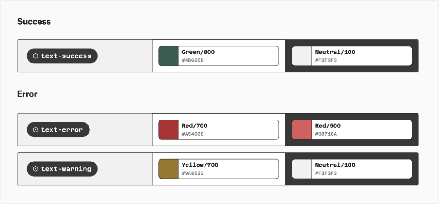
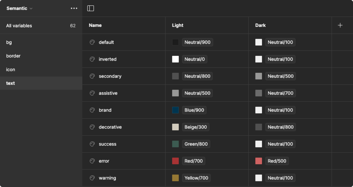
Now, the organization continues by matching the light mode colors with the dark ones in your semantic palette. The good thing is you don’t have to think of names again. Place the color value for light and dark next to each other for each semantic name to make it easier for you and the developers in the future.
The only step left now is to alias new values in the second column of the semantic palette in your local variables. Don’t forget to publish your changes ;)
Let the magic happen
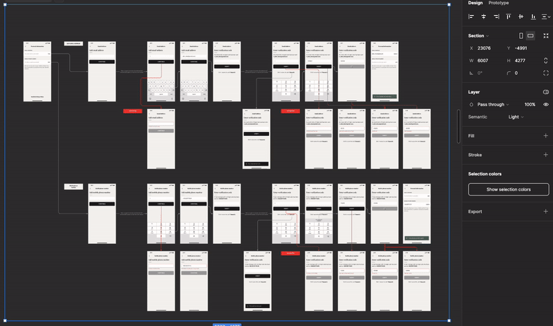
After successfully adding new mode and the variables being assigned to your design, you can now easily switch modes using the 'Setting' in the Layer panel. This function works on a single frame as well as on a section, allowing you to batch change many designs at once. It's truly satisfying to see how your designs automatically switch to dark mode after all your hard work. Take a moment to preview this magical transformation!
Summary
It's been a long journey, but the first time is always the toughest. Having now applied this process to both smaller and larger projects, I find it gets quicker each time. Keep in mind that this is just one application of variables. By following a similar workflow, you can also create modes for responsiveness. Anyway, don't limit yourself to the light side of the force - dare to explore the dark side of your project ;)
Interested in more? Learn about what we do in the field of UI, UX and UX audits. Trust an experienced software development company.
Kasia Michalska
UX/UI Designer
Share this post

