Kasia Michalska,
Maryna Suzanovich
Multiple authors
2025-03-28
Updated: 2025-04-02
#Design
Time to read
6 mins
In this article
Introduction
Remove the noise - less is more
Inform users what’s happening
Slow, slower, the slowest… mind internet connection
Allow user to navigate effortlessly
Gain sympathy with creative unhappy paths
Summary
Share this article
Introduction
Ask any designer, and they’ll tell you - User Experience is key. Some might add that UX is complex and challenging. The truth? UX is a crucial discipline that no modern digital product can afford to ignore.
While some UX improvements require deep research and testing, there are universal, easy-to-apply strategies that instantly enhance usability. In this article, we’re sharing a set of practical tips that don’t demand extensive studies but are guaranteed to make a noticeable impact on your product’s UX.
Remove the noise - less is more
A cluttered interface overwhelms users and can hurt conversions. Too many buttons, images, and text blocks competing for attention create cognitive overload, making it harder for users to take action. It’s like someone decided to wear all their best outfits and jewellery all at once. But are all these elements necessary and really useful for both the user and the business? Even in complex financial or technical platforms and services, you can always strive to reduce visual noise so users can get things done faster - without distractions or playing “Where is Waldo?”. This approach allows users to quickly complete their tasks and achieve their goals without having to scan through excessive interface elements.
How to apply?
- Conduct an “UX/UI audit”: which elements add no real value?
- Keep only the features users truly need. For instance, if certain icon buttons get clicked about once every blue moon, consider hiding them under a kebab or meatballs menu.
- Use whitespace - breathing room between elements works UX magic!
Another simple but effective way to improve UX is by reserving space for validation messages in input fields. This prevents content from shifting when errors appear - whether they trigger on blur or after submission.
Speaking of shifting content, avoid Cumulative Layout Shifts (CLS), where slow-loading elements suddenly appear and push everything else down. You can fix this by pre-allocating space for dynamic content (just like skeleton loaders do).
Interesting fact: In Japan, dense interfaces are widely accepted and actually preferred by large portion of internet users (see Japan’s demographic and aging society) showing how cultural differences impact design preferences. Read more here: Why are Japan’s Websites so Cluttered? or here The UX of Japanese web design

Request a free design consultation
Facing design challenges? Contact us for a free consultation in just 1 step!
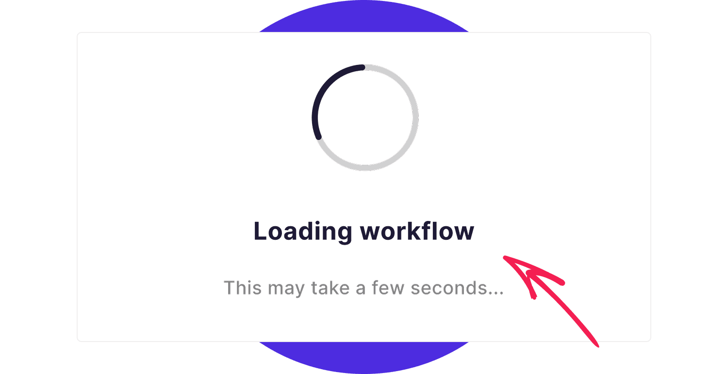
Inform users what’s happening
You know that feeling when you fill out a form, hit “Submit”, and then...nothing. No spinning wheel, no confirmation, just silence. And you think: “Is anything being done at all, or is it broken and needs to be refreshed?” Maybe you wait a few seconds, then start second-guessing: “Should I click again? Abandon the ship?” That’s exactly how users feel when an interface leaves them hanging. Don’t leave users in the dark, inform them about the system status.
How to apply?
- If something is processing, show a spinner or fancy micro animation (but don’t use complex animations that can degrade the performance, we must not forget that speed is a key factor for usability, no one likes to wait). At least show a message, like “Please wait, we’re working on it!” The users don’t like clicking the same button 10 times out of frustration. (Read more about speed in next section!)
- If something goes wrong, don’t just highlight a field in a vague shade of pink. Use a clear message what’s wrong and how to solve this: “Your password is too short. Use at least 8 characters.” Combine colour with clear and helpful text so the users don’t have to play guessing games.
- Add friendly microcopy like, “Success! We’ve got your request!” It reassures users and makes the experience less... well, cold.

Slow, slower, the slowest… mind internet connection
We’ve all been there - one moment you have blazing-fast internet, the next you step into an elevator and suddenly, you’re in a signal black hole. Even if you have a top-tier 5G router or fiber-optic connection at home, users can lose connectivity anytime, anywhere.
Designing lag-proof solutions like skeleton loaders, progress indicators, and spinners can greatly enhance UX by keeping users informed about what’s happening (see previous section). The key is choosing the right approach based on expected loading times. Talk to your developers about best- and worst-case scenarios to determine the ideal solution.
How to apply?
- Short loading times → Use a skeleton loader or spinner to signal that content is coming soon.
- Long loading times (e.g., file downloads or multi-step processes) → Implement a progress bar with a percentage indicator to show ongoing progress.
- Very long processes → Display an ETA so users know they can switch to another task while waiting.
Don’t forget images and fonts, which can also slow things down. If you need multiple font variants, variable fonts can help reduce file size - allowing you to load one file instead of multiple font styles. However, if a variable font is too large, consider loading only the most important variants first and deferring the rest.
Why speed matters?
- Fast sites convert up to 3x more than slow ones.
- Pages that load in under 3 seconds have an 8% bounce rate - a number that skyrockets when load times increase.
- 45% of users say they’re less likely to buy if a website is too slow.
- 53% of mobile users abandon a site if it takes more than 3 seconds to load.
- The average page speed of top-ranking sites on Google is 1.65 seconds, hinting at a strong correlation between speed and SEO.
Allow user to navigate effortlessly
When it comes to navigation, it's better to provide too many options than too few. Imagine a user navigating your product: if they have both a back button and breadcrumbs, it might seem like overkill at first. However, this setup empowers them to move back a single step or jump multiple steps with ease. Now, consider the opposite scenario - what if the only way to go back is the browser’s native back button? That’s a risky bet since browser behaviour can be inconsistent, leading to frustration and confusion.
Navigation is deeply tied to information architecture (IA) - one of the foundational pillars of UX design. A well-planned IA ensures a clear, intuitive structure, allowing users to move seamlessly between pages without feeling lost. Defining this hierarchy early on helps designers create a logical sitemap and establish strong connections between different sections of the product.
How to apply?
- Plan ahead: Take time to design a solid sitemap and information architecture before diving into UI design.
- Never rely solely on the browser’s back button: give users explicit ways to navigate.
- Choose the right navigation pattern for your product: whether it's a tab bar for a mobile app, a sticky top menu for a website, breadcrumbs, floating action buttons, or a combination of these elements.

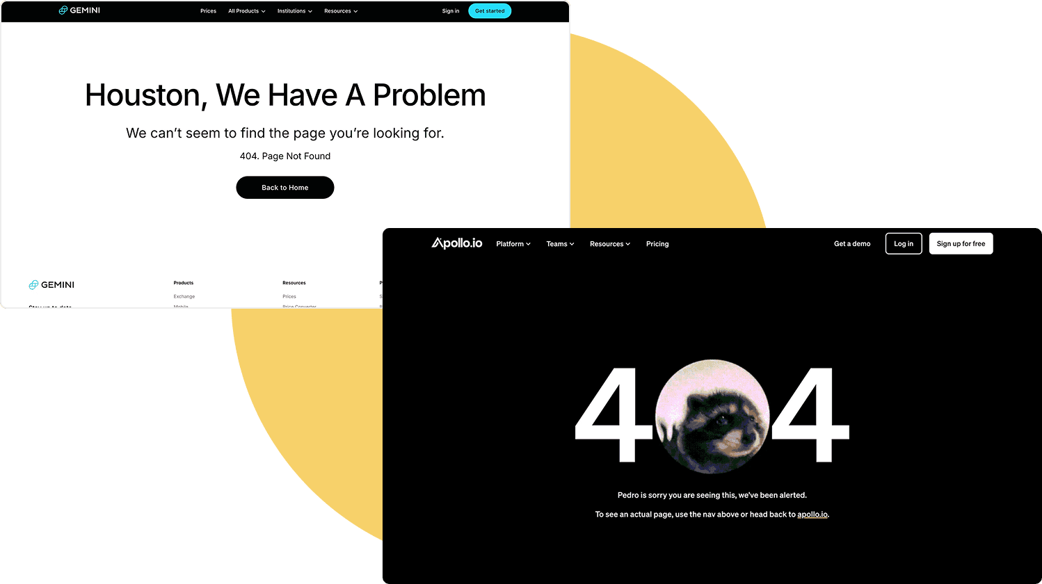
Gain sympathy with creative unhappy paths
No matter how well-designed your site is, users will inevitably hit dead ends - like a 404 page due to broken links or a mistyped URL. Instead of treating these as pure errors, turn them into opportunities to create a memorable experience.
How to apply?
Since expectations for error pages are generally low, this is an easy win. A little creativity here can turn a frustrating moment into a delightful one, strengthening the emotional connection between users and your product.
- Use friendly, humorous UX copy to make users smile.
- Add engaging visuals or animations to soften frustration.
- Provide helpful navigation options so users can quickly find their way back.
Summary
We've covered some of the easiest and most effective ways to optimise UX in your product. While there are countless other UX improvements you can make, many require a more tailored approach.
Use this list as a go-to guide whenever you're designing a new product from scratch, expanding an existing solution with new features or when conducting a UX audit.
Kasia Michalska,
Maryna Suzanovich
Multiple authors
Share this post

