
4.5★
Current App Store rating
12 members
Cross-functional team: design, frontend, backend, QA, DevOps
Award-nominated
Submitted for industry app award
The project
Hemfrid is the largest home services company in Sweden. When they came to us, their customer-facing app was generating consistent negative feedback - users found it slow, unintuitive, and difficult to navigate. They needed a full redesign, not a patch.
Through research, wireframing, and iterative usability testing, our team rebuilt the app from the ground up. The result was nominated for an industry award and currently holds a 4.5★ rating on the App Store.
Customer
Hemfrid
Service
Product design
Backend and API’s
UX/UI design
Quality Assurance
App development
Technology & Tools
React Native
Figma
NestJS
Prototyping & usability testing
We built a prototype from the wireframes and used it directly in user testing sessions — observing how people navigated, where they hesitated, and where they dropped off. Heatmaps gave us quantitative signal to layer on top of the observed behaviour. Only once those iterations were validated did the team move to final interface design.


New & improved features
The redesign touched every major part of the app. Cleaner layouts, fluid animations, and navigation that gets out of the way. Below are the features that changed the most.
Duration
Oct 22’ - now
Team
12
members
Hands-on preview: Try out the app in Guest Mode
New and potential customers can now explore the full app before signing a contract, purchasing a subscription, or creating an account. Guest Mode lets users preview every feature and decide if it fits their needs before committing.
We also redesigned the Home tab entirely - renaming it "Discover" and filling it with articles, tips, and upcoming booking cards for logged-in users. It's no longer just a dashboard. It's a reason to open the app.
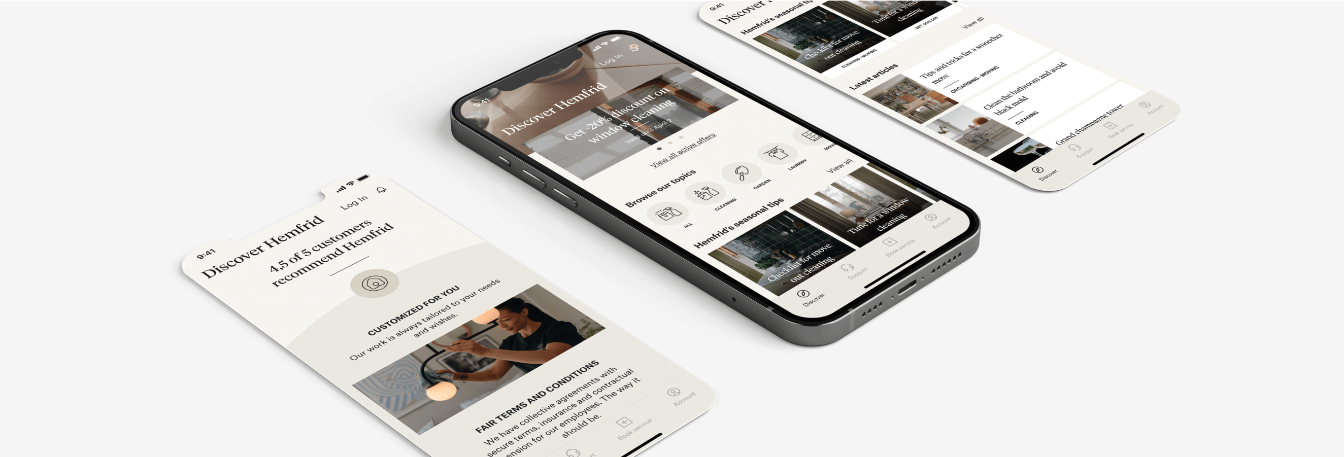
Explore services - reimagined
The previous Book Service tab had an accessibility problem: text overlaid on images made services hard to read, and the layout didn't encourage browsing. We rebuilt it from scratch - clean photography, a coherent visual overview of all available services, and a ZIP code banner so users can check availability in any area, not just their registered address.


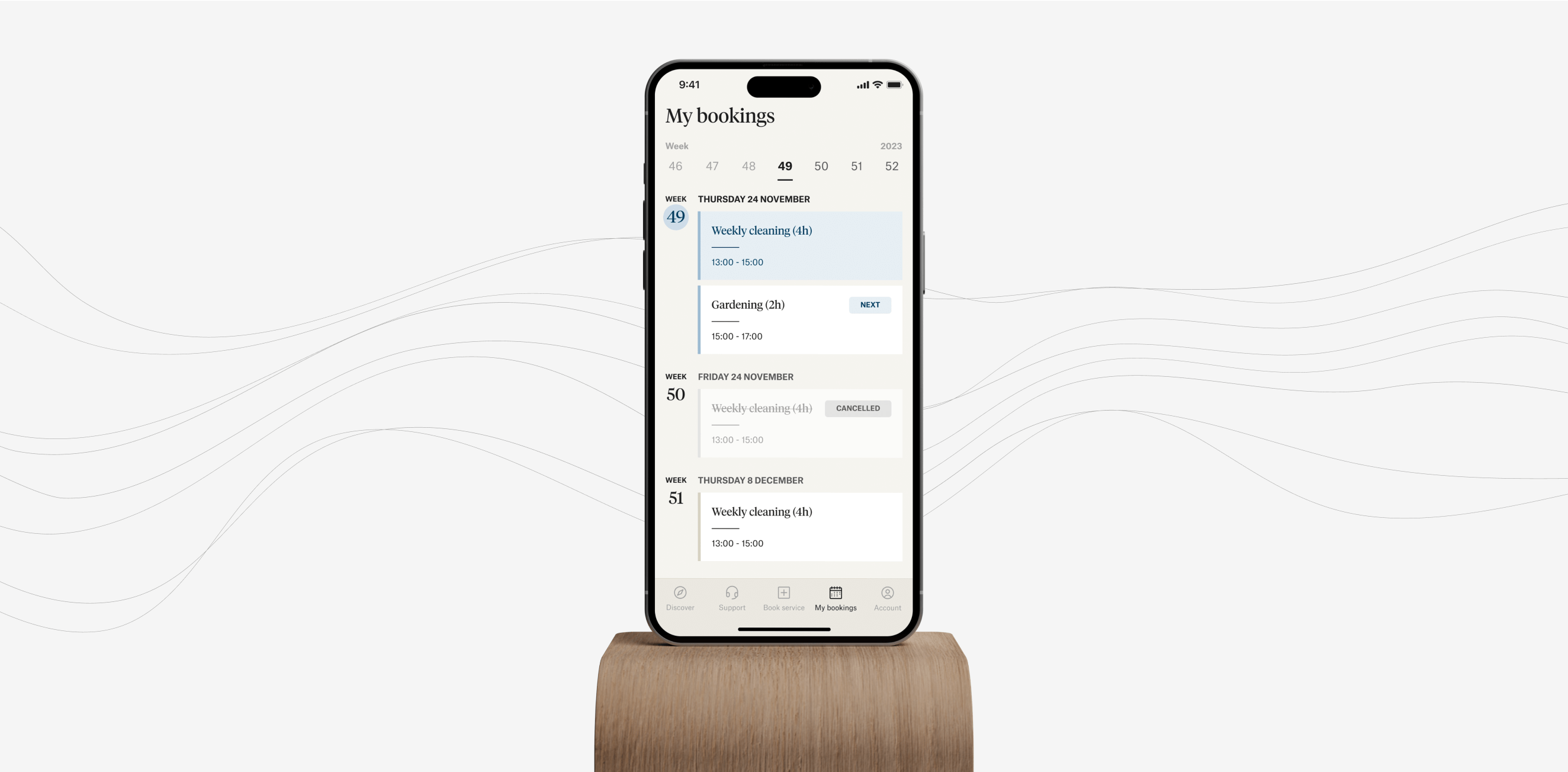
Bookings timeline: Everything in a reach of a scroll
Data showed that around 90% of users are on weekly cleaning subscriptions - they already know their schedule and rarely needed to use the calendar. What they did need was a faster way to find past and upcoming bookings without multiple taps.
We replaced the calendar-first view with a scrollable timeline: all bookings in one list, past and upcoming, with a week slider as the default view. The week slider came from a cultural insight - Swedish users tend to think about appointments in weeks, not months. The design reflects that.
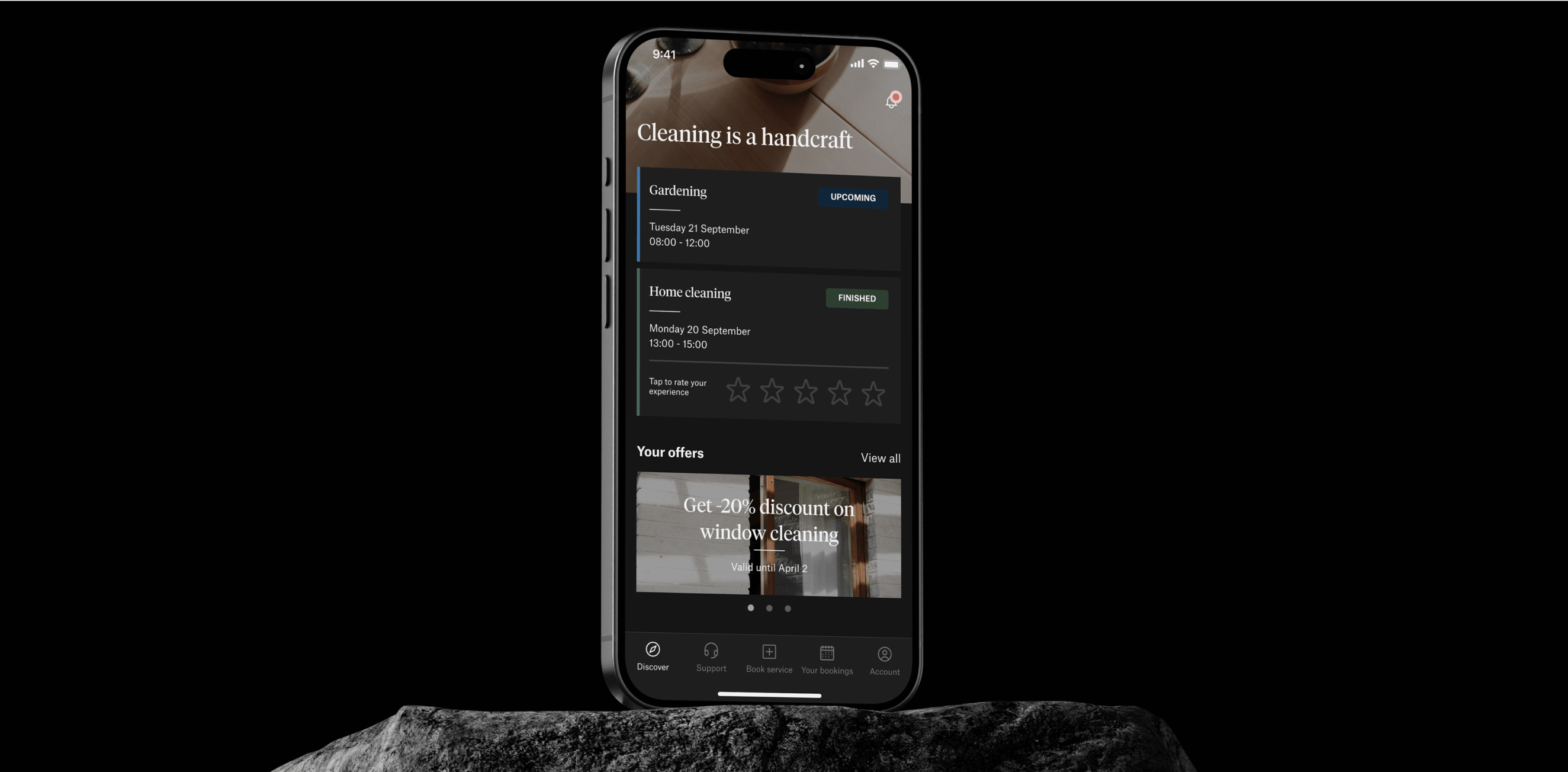
Developing dark mode
During development, the design team built the colour system using variables - a decision that paid off quickly. When the client asked about dark mode, frontend implementation took a few days. The groundwork was already there.
Lessons learned
The week slider taught us that cultural context belongs in the design process, not as an afterthought. Recognising how Swedish users think about time produced a better product than any generic solution would have.
The dark mode timeline reinforced something we already believed: decisions made early in the design system compound later. Variables, tokens, and component structure aren't overhead - they're the thing that makes fast iteration possible.
And throughout: every meaningful change came from user feedback. Not from assumptions about what users should want.
Shipping a feature like the Discover tab required assets, editorial direction, and sign-off from the marketing team before it could go live. That dependency could have become a bottleneck. It didn't, because design and product owners worked in the same process from the start - not handing off at the end. When cross-team input is needed, the time to build that working relationship is before the work starts, not during it.
Want to light up your ideas with us?
Kickstart your new project with us in just 1 step!
Prefer to call or write a traditional e-mail?